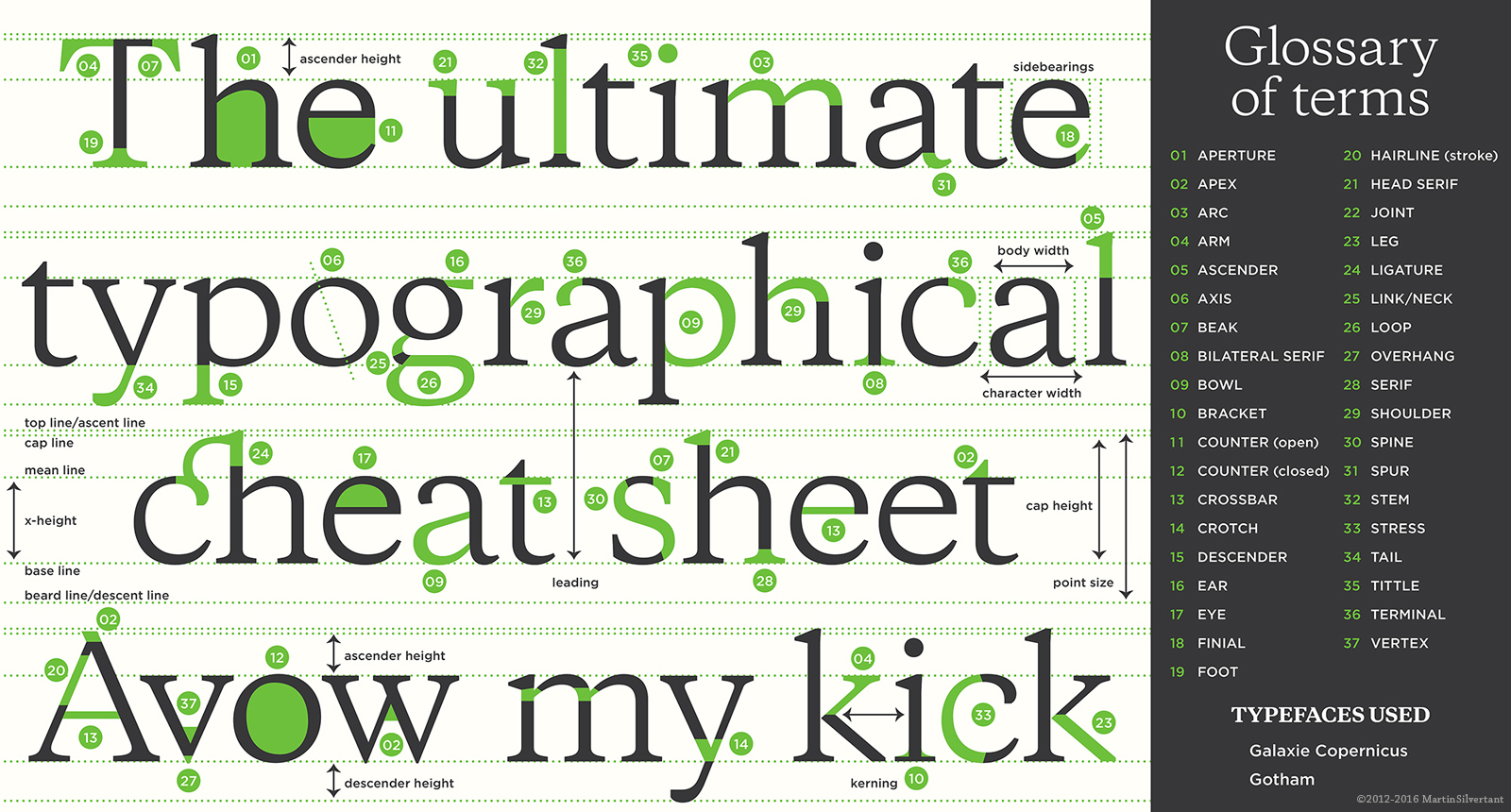
Crotch. Spur. Lobe. Bowl. Aside from tittle (also known as the dot above some lowercase letters), the anatomy of typography isn’t particularly sexy or memorable. Most graphic designers, myself included, can’t recall what each anatomic term refers to. After all, what are we, doctors? So how do we go about knowing which fonts are best to get our message across?
At the bare minimum, every designer should know the difference between a serif and sans serif font. If you don’t, I’m going to suggest you brush up on your typography 101. Or, if you’re feeling particularly nerdy, go ahead and watch the movie Helvetica (Yes, this is real.). There are a few exceptions depending on font size and how/where the font is used, but the general rule for graphic designers to abide by is serif fonts are best for print, and sans serif are best for the web. That’s easy enough, right? Of course not, it could never be that easy.
Take all the hate towards Comic Sans from this article as an example. Some designs clearly missed the mark by using a sans serif font in the body of text. But aren’t they following the rules we’ve been given? The reality is that our designs are completely subjective. Even when basic rules and principles are followed, our design may not convey our desired message.
Does an ambulance wrapped in Comic Sans make you feel like you’re in good hands as a grown adult? Or do you imagine, as I do, the inside is stocked full of lollipops and superhero Band-Aids? What good is that when you’re near death being rushed to a hospital? But hey, at least you can remember the phases of death from that presentation you sat in on. Or were you too distracted by the presenter’s font choice to understand the seriousness nature of it? After all, “comic” is right in the name.
Unwanted outcomes like these are why making correct font choice is so important. Choosing the correct or appropriate font should always be part of your initial design process. Even if the rules and principles of design are followed, it isn’t an automatic guarantee your design is aesthetically pleasing or conveys your message to the best of your ability. As great a thrill as it is to poke fun at Comic Sans, it’s important to understand that there are instances certain fonts just aren’t appropriate and you must rely on your judgment as a designer. Also, unless you’re creating invites for an Egyptian themed party, Papyrus is never an option.