Whether you’re a public entity, a private company, or a one-person specialty shop peddling handmade macaroni art out the back of your mother’s minivan, your brand is the very first thing consumers experience. Although a brand is much, much more than just a logo. Your logo is a visual cue and reminder of the larger brand experience. A great logo is one that has been specifically designed to tell your story and engage consumers. In a society where we are bombarded with logos every day, how do you make sure your logo stands out?
STRAY FROM THE OBVIOUS
Your logo doesn’t need to be a literal representation of the goods or services you provide. In fact, some of the best logos leave their message open to interpretation and focus on representing company culture and beliefs. Take the Apple logo– yes I know it’s an overused example, but there’s a reason it’s so iconic. Was it originally a nod to Sir Isaac Newton’s theory of gravity? A biblical reference? Or did Steve Jobs simply enjoy eating apples? Whatever the core (pun intended) reason is behind your logo, no two people are going to have the exact same reaction when seeing it for the first time. So don’t worry if it isn’t an exact depiction of your company, and instead focus on the emotions it triggers.

Apple has one of the most iconic logos of any brand. It strays from the obvious
by not featuring a computer or other piece of technology which has allowed Apple’s
logo to age well, only requiring a few minor refreshes throughout the years.
KEEP IT SIMPLE
Given our short attention spans, simple logos are more memorable and easier to recall. Consumers shouldn’t have to study your logo in depth, lock it into memory or decipher its message. It should prompt their emotions right away. This can be done through the use of color, shapes, fonts, and other visual elements which work together to convey those emotions. And remember, just because a logo is simple doesn’t mean the message is any less effective.


Big Sky County Water and Sewer District includes service to Montana’s biggest winter destination, Big Sky. Our
team redesigned their logo keeping the emphasis on the region’s biggest icon, Lone Mountain. We also simplified
the logo’s artwork and text, ensuring it would reproduce well at different sizes both printed and digitally.
AVOID TRENDS
Every year new design trends emerge to dominate the logo design industry. While these new fads are great to explore and use when appropriate, creating a logo around them will require a redesign once those trends quickly expire. Now I know what you’re thinking, don’t design trends come full circle? Well, I hate to break it to you and the avocado green appliances you likely still have in your kitchen, but there are certain trends we just don’t want resurfacing.
CREATE VERSATILE FORMATS
A logo needs to look its best in every possible format: digital or print, large or small, one color or full color, vertical or horizontal, and so on. A single logo design is never enough, so don’t be afraid to have alternate designs for different applications.


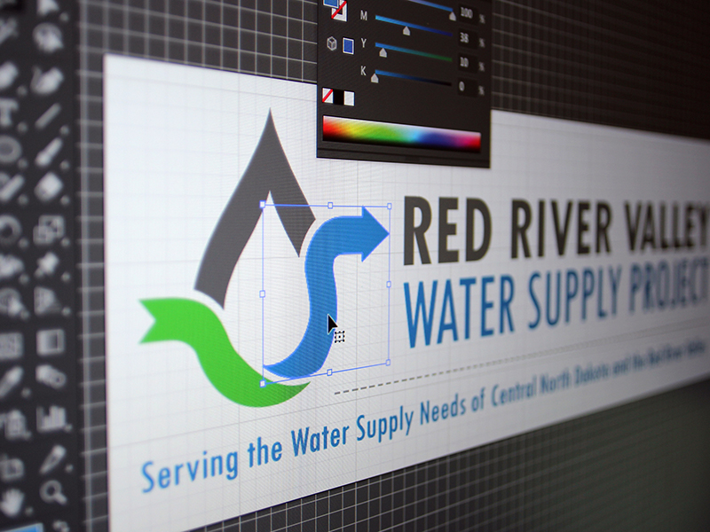
The Red River Valley Water Supply Project is a water system that when completed will provide water
to nearly 50% of the population of North Dakota. A couple of the main goals are to secure funding for the
project, and to communicate clearly the costs and benefits of the project to users. Our team used these
goals as a starting point when coming up with the project’s logo by using green and blue to illustrate funding and
water, and the use of arrows to show the importance funding plays in moving the project along.
We also set our client up with many different logo varieties for the various needs they may encounter.
HIRE A PROFESSIONAL
There’s far more that goes into creating a logo than just choosing artwork and colors. The principles and elements of graphic design play a key role in visually communicating effective messages. Whether it’s understanding which colors evoke certain emotions, how font choices influence your message, or how important hierarchy is when laying out a design, graphic designers understand these rules and put them to work to make sure your logo is effective in sharing its intended message.

