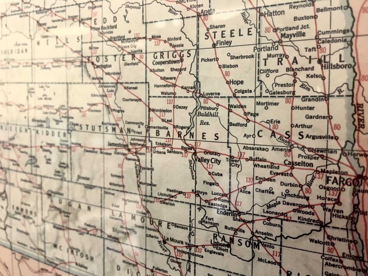
Ever since I was a little girl, I have loved maps. I loved maps of small places, like the plat book for my township. I also loved the globe my grandmother had in her spare bedroom. Maps meant there were new places to explore.
Now, as a communicator, I love maps for a different reason. Maps are a key piece of any project I work on. Typically, one of the first, and most important questions at a project meeting is “Where is this at?”
Maps are one of the best, most logical ways to share information. They clearly show connections that dozens of tables and graphs can’t convey.
It’s no coincidence that many infographics use maps as a base layer. That technique helps the reader start with a point of reference, especially if it’s a map of a place they know. When you know the location being discussed, it helps the rest of the information to be filed in your brain accurately.
As tools, maps are becoming more advanced and that gives everyone more ways to find solutions, even for big problems.
Take biodiversity and conservation efforts as an example. Scientists are now using maps to better understand forest composition. Researchers are using airborne imagery from spectrometers to measure wavelengths of light being reflected by the forest canopy over Peru. This helps them figure out what chemicals are present and in what concentration. The analysis helps them create a map of traits the forest has, thus giving them the ability to identify areas that need protection or a specific type of conservation management.
We are fortunate to have excellent GIS staff at AE2S. They have no problem whipping up maps to help our clients explain projects or our communication team educate about infrastructure. But there is always more we can do. This year I plan on taking some time to think about how to use our new Unmanned Aerial System in conjunction with project maps to help explain projects.
Take some time to think about what projects you are doing that could, or should, be using more maps. And if you are looking for some neat ways to spend a few minutes, try National Geographic’s interactive MapMaker. It’s a great way to see many different and interesting data sets like the world’s Gross Domestic Product, the range of the Cheetah and volcanic eruptions.
So the next time you sit down to work on a big communications effort, don’t forget the lovely and versatile map. A little bit of data can go a long way, especially when it’s given latitude and longitude.

