Here’s a List of 5 Free Things You Can Do To Improve Your Online Presence!
- Create Google accounts
- Review your traffic monthly
- Find out how “healthy” your website is
- Check your pages for broken links
- Review your website’s mobile user experience
Keep reading to see how you can make these improvements…
I’m trying to keep this bite-size and I’m coming at it from a certain angle. As a Web Designer / Developer for 20+ years, I know there is more I could add to a list like this. I wanted to keep the list website focused and simple to implement. Most importantly, these recommendations are free ways to improve your Search Engine Results Page (SERP) ranking, among other benefits! By doing a little cleanup and spending a few minutes making improvements your website will perform better, be search engine optimized and your user experience will improve! AE2S Communications will help point you in the right direction.
Create an All-Purpose Gmail Account.
Many of our suggestions mention Google. Using staff emails @yourwebsite.com can cause a loss of knowledge about who signed up for what online and who manages your online presence, especially if there is staff turnover. We’ve found having a free Gmail account helps in general to maintain online account access when you have a web-based, yourstaff@gmail address. The general email address, where multiple staff know the login credentials, allows your organization to minimize the impact of staff transition, but as it concerns your website, it allows integration of popular web-based Google platforms/tools, like Google Analytics, reCAPTCHA, Google Maps API and so on.
Review Your Traffic. Set Your Search Engine Results Page goals.
Take 30 minutes to look at your website analytics. Which pages your users visit, how much time they spend on a page, how long they stay, how they found you (traffic source), the device they use, and so on. While you do review your traffic, consider these questions and goals:
- Are you trying to increase traffic to your homepage?
- Do you have enough content for your pages?
- Why are there more views for a certain page?
- Are you aiming for people to contact you?
- Do you want your website visitors to buy something?
- Are you trying to gain subscribers?
- Do you have a goal of generating cross traffic between all your communications channels?
How Healthy is Your Website?
When I think about website health, I’m considering how it performs out there on the web. Are your images scaled? Try Google’s Page Speed Insights tool to check mobile and desktop performance. GTmetrix also has a great free tool for checking web page performance including server response time. Which reminds me, if you have a WordPress or .php website, be sure to check that your website host is using the most recent PHP version on your server. This is getting a little technical, but it’s important as it applies to your website’s performance and security.
Check your Website for Broken Links Within Your Website
I called out checking for broken links separately from website health because of its importance to SEO and User Experience. Do a web search on how broken links affect your SEO, and you’ll find a myriad of information and resources as to why it’s important. To be clear I’m not talking about websites that link to you, but you should check those too! This is about your inter-page links and links that leave your website, which are much easier to fix. WordPress website users can choose from several plugins that can be installed to perform a link check.
Mobile Compatibility
Your website is built on a “responsive” platform. That’s great. The desktop version will resize to fit smaller viewports. Don’t stop there! What works on desktop, may not on mobile.
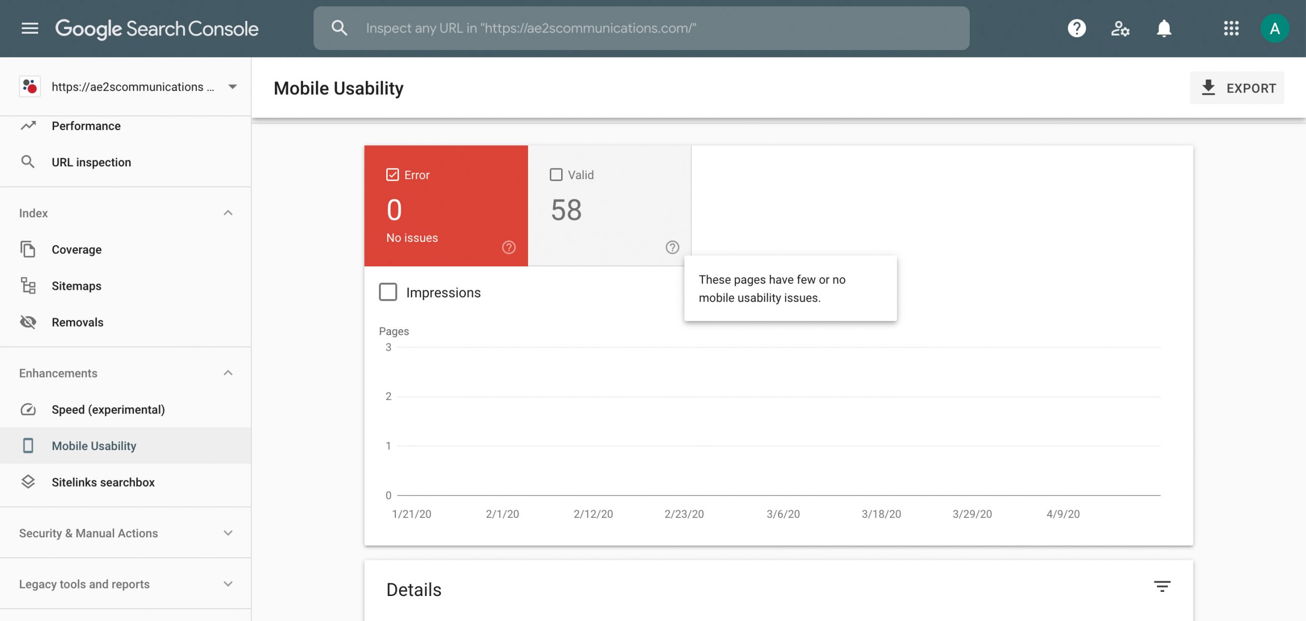
What do I mean? Test your website with Google’s Mobile Friendly Test. The most common error I see are “Clickable elements are too close together”. Look at your fingertip. Those text links you click with your cursor on your computer, scale down to very small targets for your fingertips to tap distinctly. There are a variety of free online tools, like Google Search Console that will help you improve your website’s mobile experience by pointing out exactly these types of potential user experience pitfalls. Once you’ve connected your account, Search Console will periodically send you an email after Google crawls your website when it finds anything that needs your attention. There are page builders for WordPress built websites for example, think: Content Management Systems (CMS), that will allow you as an admin, to change and display content in a different way for mobile screens or the units to assign size. Consider using “rem” vs “px” for accessibility compatibility and better mobile response. If you don’t use a CMS ask your web developer about creating alternate CSS style rules for mobile viewports.
Want to check your whole website for mobile compatibility?
Here’s a free tool for that, no registration required, at https://www.experte.com/mobile-friendly.
There’s much more we could talk about, but these free tools are a good place to start! If you have questions, please feel free to contact me at Mike.Witt@ae2s.com.