The City of Barron, WI Tourism Committee was seeking to identify and share what makes Barron unique. Through interviews with community ambassadors and outreach at the local farmers market, our team found that it was more than just the town that was unique, it was the people and their welcoming sense of community. Through good times, and bad, the people of Barron will be there for you. “If you need help, all you have to do is ask.”
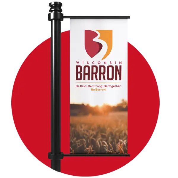
The Barron brand centers around the key characteristics of the community and their overwhelming pride in their city. The visual identity for the brand has multiple meanings. The shield signifies strength, the crest of the shield represents Vermillion River which flows through the City, and the river shapes a B, as in Barron or “be” which is the foundation of the brand.
The team developed a brand rollout campaign that kicked off at the City’s Fall Festival. The rollout featured a banner unveiling and button giveaways for community members to wear with pride and embrace the new brand.
Key Project Elements
We’re here to support you.
When you need it.
We know you’re busy (and often with limited resources). We’re here to support you and your staff as you make a difference in your community.
Don’t you dare press the red button.
But seriously, do! We’re excited to partner with you!